Three client calls in a single week, all asking some version of the same question: "We're thinking of doing warm minimalism — is that what you do?" That's when we decided to write this down.
The honest answer to the question is: yes, in the sense that we like warm colours and we don't like clutter. No, in the sense that warm minimalism as a branded design movement has almost no content. It's a palette and an editing philosophy, not a coherent aesthetic. Which is fine. Most design "movements" that emerge from social media are palettes and editing philosophies. But it means the term doesn't tell us much about what a client actually wants.
What the trend is actually describing
The shift that the trend forecasters are calling warm minimalism is real, even if the name is lazy. For about a decade, the dominant residential aesthetic in northern Europe — and increasingly in upscale Italian renovation — was a particular kind of cool, white minimalism derived (somewhat loosely) from Scandinavian modernism and Japanese wabi-sabi. Concrete, white walls, black steel, pale woods. It photographed beautifully. It was also quite difficult to actually live in: acoustically hard, lacking in tactile variation, cold in the literal sense because thermal mass was unfashionable.
What's happening now is a correction. Clients want rooms that feel warmer without abandoning spatial clarity. They want natural materials that have personality — stone with visible bedding planes, plaster that shows the hand, textiles with real weight. They want ochre and terracotta and warm linen rather than pure white and bleached oak.
None of this is new. It's the Italian and Portuguese domestic tradition that existed before it became unfashionable, and it will exist after the trend has moved on. We've been working this way since 2019 not because we're ahead of anything but because Marta grew up in Umbria and has strong opinions about how lime plaster should be mixed.
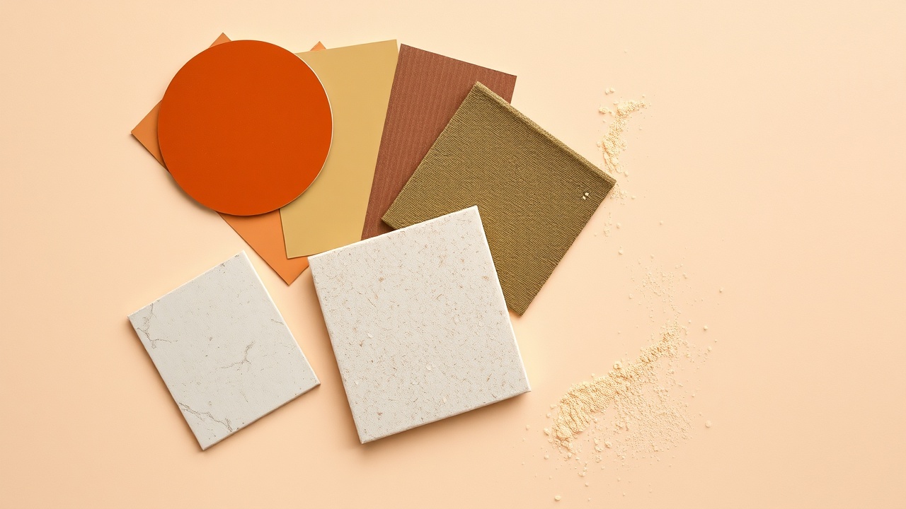
Colours we actually use
We don't specify by paint reference numbers in our proposals. Paint chips lie — the colour looks different at every scale, under every light, next to every other surface in the room. We specify by sample, applied in situ at roughly A3 size, viewed at multiple times of day. That said, we can describe the territory.
Whites that aren't white. The most common specification error in our category of work is choosing a paint or plaster that's described as "warm white" and is actually white with a tiny amount of yellow added — which looks fine on a chip and greenish in reality. The warm whites we use consistently have significant amounts of raw umber or yellow ochre in the base, enough that they read as cream or stone in north-facing light. They often look wrong in the tin. They're usually right on the wall.
Earth tones with restraint. Terracotta, ochre, and tobacco are having a cultural moment, which means they're also being overused. We use these colours in ways that don't require the trend to last: in small quantities as accents, or as the dominant tone in a single room where the rest of the house is quieter. A terracotta bedroom in a house that's otherwise ivory and stone will still read well in ten years. A terracotta-everything house is a renovation project in waiting.
Greens that feel botanical. Olive, sage, and what I'd describe as "old eucalyptus" — greens that have enough grey and brown in them to read as sophisticated rather than fresh. These have replaced the very blue-green teals that were dominant around 2020–2023. The greens we're using now age better partly because they're closer to the natural world as it actually looks in northern Italy in October: dusty, warm, faded at the edges.
What we're not using. Greige. Pure greige — that mixture of grey and beige that dominated specifications from approximately 2015 to 2022 — has the problem that it's been everywhere simultaneously for a decade and now reads as default rather than chosen. We're not opposed to it aesthetically; we're opposed to it because it's invisible. A room should have a colour, even if that colour is very quiet.
On accent colours
We avoid accent colours as a category. The concept — everything neutral, one statement colour — tends to produce rooms that feel like they have a theme rather than a character. The rooms we admire most, and try to create, have colour that emerges from the materials themselves: the variation in a stone surface, the warm undertone of aged wood, the particular brownish-red of a hand-fired terracotta tile. These are colours that don't need to be coordinated because they come from the same geological and agricultural reality.
When we do introduce deliberate colour — a painted joinery piece, a textile in a specific tone — we choose colours that could plausibly be materials: a blue that reads like old denim worn to softness, a green that's indistinguishable from oxidised copper at a distance. Colours that look like they got there naturally, even if they didn't.
A practical note on light
Colour decisions made under artificial light are wrong unless the artificial light is very good. We've started including a lighting specification in every initial site visit, not because we're trying to upsell lighting services but because we've learned that approving a wall colour under the contractor's temporary work lights — or worse, on a phone screen — is how you end up repainting a room.
If you're making colour decisions yourself, see the samples in the actual room at different times of day. Photograph them on a cloudy day, not a sunny one. And remember that the sample will always look slightly different at room scale — usually more saturated, occasionally greener if the base formula is slightly off. Allow for this.
We're happy to talk through colour decisions for projects we're not leading, as part of our consultancy offering. It's a good use of an hour or two of studio time and cheaper than repainting a bedroom.